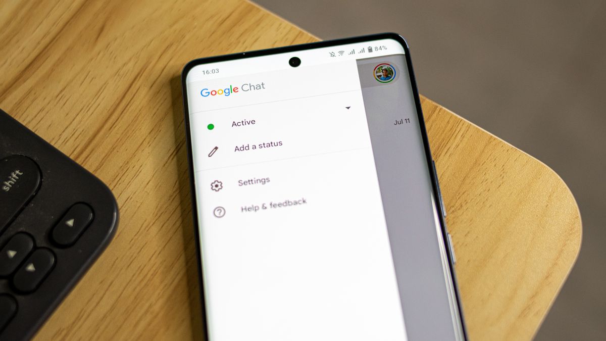
Get ready for a game-changing Google Chat UI update on Android and iOS!

Google is updating its Chat mobile app with a new look. The redesign includes a new bottom navigation bar with shortcuts to home, direct messages, spaces, and mentions tabs. This update is in line with the recent overhaul of Google Chat’s web version. Android and iOS users can expect to see this redesign in the next few weeks.
The new bottom navigation bar will provide quick access to different areas of the messaging platform, making it easier to navigate and use. In addition to the navigation update, Google has also introduced new message bubbles and a new logo to make the Chat app look more modern.
This redesign is a significant improvement for the mobile app, bringing it closer in line with the web version. Previously, the bottom nav bar only had two main tabs available on mobile—Chat and Spaces—so this is a welcome change for users.
The update will roll out to Android and iOS devices over the next few weeks and will be available to Google Workspace customers and users with personal Google accounts. Overall, this redesign aims to enhance the user experience and make Chat more accessible and user-friendly for everyone.
