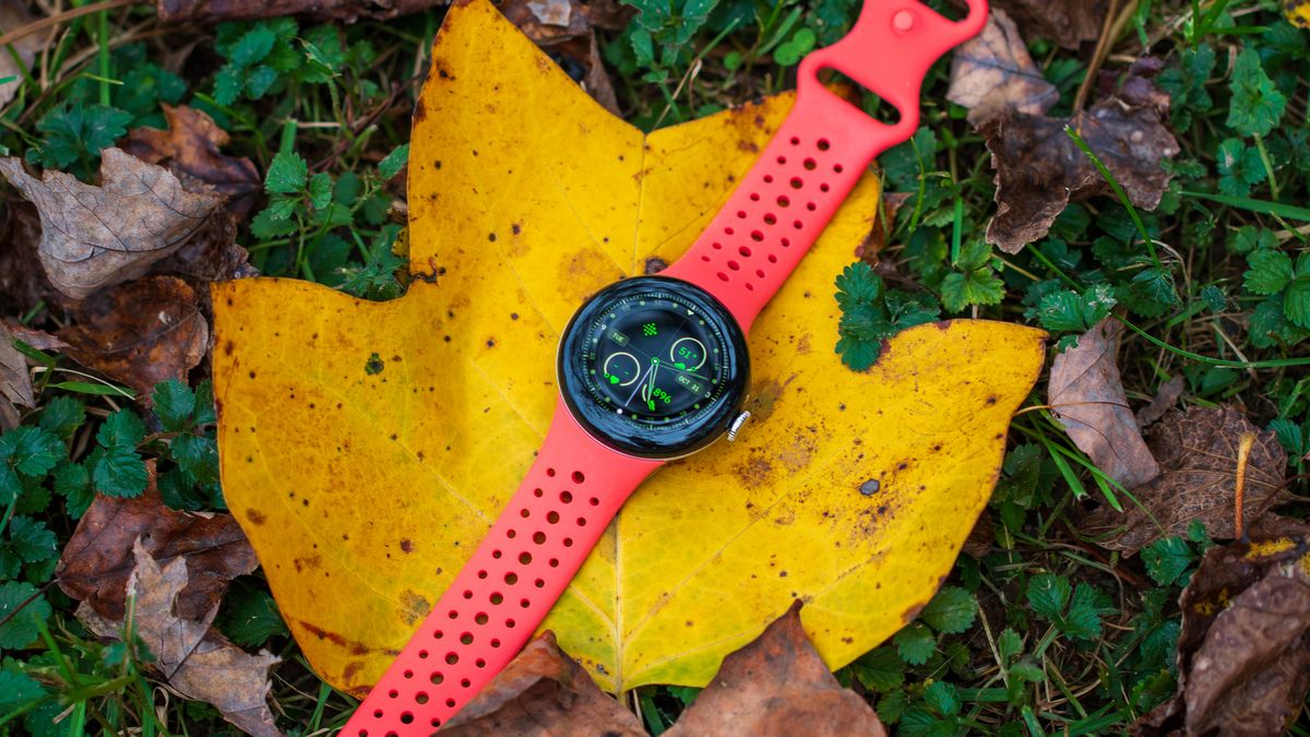
Upgrade Your Pixel Watch with Dynamic Color and Material You for a Stylish Look!

Google has been busy making changes to the Pixel Watch UI, with the latest update bringing a new blue color scheme to the interface. This change is part of the Dynamic Color theming, which allows users to have different color schemes based on their preferences and the wallpaper on their Pixel phone.
The new Dynamic Color scheme is currently seen on the Pixel Watch 2 running on Wear OS 4. The update has brought a blue hue to the interface, including the Quick Settings panel, buttons, and more. This change was first spotted by 9to5Google, who noticed the shift from the previous white hue to a new blue shade on icons and buttons across the interface.
Screenshots shared by 9to5Google show that the Quick Settings panel now has a grey background for all settings buttons, but the icons appear blue. The change can also be seen on buttons such as “Clear all” in the notifications pane on the Pixel Watch 2. This color scheme change is expected to appear across the interface, including apps, quick settings, buttons, and more.
It’s still not clear whether users will be able to choose from preset colors or if the color scheme will be set based on the watch face. Previous findings have suggested that users may have the option to enable a Dynamic Color scheme with color accents across the UI.
The Pixel Watch 2 represents a significant upgrade over its predecessor, offering a faster, more efficient chip, better battery life, and improved sensors for health and fitness tracking. The new color scheme on the Pixel Watch 2 is just one of the many updates Google has been rolling out in recent months, including a new blue hue for the mobile version of the Google Play Store.
As the updates continue to roll out, Pixel Watch users can look forward to a more customizable and visually appealing interface, making their smartwatch experience even better. Stay tuned for more updates on the Pixel Watch UI and other Google products.
