Get Ready to Rock: YouTube Music’s Enhanced Now Playing UI Reaches Even More Users

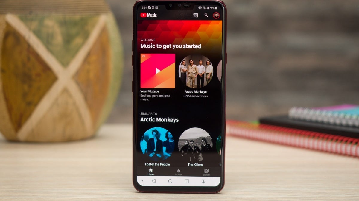
YouTube Music has a new look! The screen where you listen to your music has been changed to make it look nicer and easier to use. People first saw the new look in October, but now more people are starting to get it.
The biggest change is that the background of the screen now has a gradient instead of just one color. This makes the album covers look better, especially if they have bright colors. The buttons for Up, Next, Lyrics, and Related are now floating icons, which makes the screen look cleaner and more organized.
Even though this is a small change, not everyone has noticed it yet. Some people are still waiting to get the new look on their app. But they will probably get it soon.
YouTube Music is also getting ready to be a place where you can listen to podcasts. This is to compete with Spotify, another popular music app. Google Podcasts, which is a different app for listening to podcasts, will go away next year. So YouTube Music will take its place.
With these changes to the app, it looks like YouTube Music is working hard to be the best music app out there. And maybe someday, it will be even better than Spotify!
